Rolls-Royce Kemas Kini Logo & Branding Menjelang Pelancaran Ghost
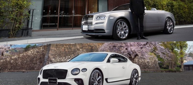
Rolls-Royce mempunyai banyak cabaran di hadapan mereka. Mereka hanya ada seminggu sebelum Ghost baharu dilancarkan dan Mercedes-Benz S-Class serba baharu pula akan dilancarkan pada masa yang sama. Tambahan, Bentley sudah mengalahkan mereka dengan model baharu segmen ini dengan Flying Spur baharu yang dilancarkan pada awal tahun ini. Lebih-lebih lagi, bukan seperti Rolls-Royce, yang terus membuat dan menjual limo bersaiz penuh Phantom, Bentley telah memutuskan untuk membiarkan Flying Spur terbaharu memenuhi peranan Mulsanne yang lebih besar. Ini bererti Rolls Royce kini harus memutuskan sama ada Ghost akan tetap menjadi lincah, mini-Phantom yang lebih praktikal atau apakah ia akan meningkatkan permainannya untuk melawan Flying Spur yang diperbesar.

Di tengah-tengah semua ini, jenama telah memutuskan sekarang adalah masa untuk mengemas kini identiti korporat SEPENUHNYA. Jenama kini mempunyai identiti jenama baharu yang ditujukan untuk penonton yang lebih muda. Ia akan dilancarkan pada bulan September, sekitar waktu Ghost baharu dilancarkan.

Apa yang menonjol?
Tafsiran 2-D mengenai Spirit of Ecstacy

Warna jenama baru: Spirit Ungu dilengkapi dengan Rose Gold

Typeface Riviera Nights yang direka semula.

Tanda kata yang direka semula “Rolls Royce Motor Cars”

Ekspresi Semangat Ekstasi

Kenyataan Media
“Take the Best that Exists and Make it Better”. Since these words were spoken by the marque’s co-founder, Sir Henry Royce, Rolls-Royce has experienced evolutionary change, from the creator of the ‘Best Car in the World’, to the world’s leading House of Luxury. The company’s products are today revered as exemplary examples of hand-craftsmanship, born from the finest materials and honed with masterful skill, while the brand and its illustrious figurine, the Spirit of Ecstasy, have become icons for the very best and truest examples of their kind. Indeed, Rolls-Royce, is, a synonym for luxury.
In recent years, Rolls-Royce has experienced change at a quicker rate than ever before in its storied past. The Rolls-Royce portfolio has expanded to five models, each with their own distinct character, and almost every motor car created at the marque’s Global Centre of Luxury Manufacturing Excellence in Goodwood, West Sussex, is Bespoke – tailored to the lifestyle requirements of diverse and discerning patrons. The introduction of Black Badge, the marque’s alter-ego, has met the needs of a subset of these clients, answering their call for an edgier, alternative Rolls-Royce, one that carries an assertive and dominant persona. With such choice, it is no surprise, therefore, that the age and demographic of the marque’s clients have decreased significantly to an average of just 43.
How then, does a brand present itself via its visual language and remain true to its heritage while speaking to its bright and contemporary future?
Rolls-Royce appointed Marina Willer, partner at Pentagram – a multi-disciplinary design studio which is revered within its field – to create a new brand identity that could move beyond the mechanics of being the ‘Best Car in the World’, to encapsulate the brand’s presence and standing as a true House of Luxury. The identity was designed to appeal to the new demographic of clients and all that they represent both digitally, and physically.
Pentagram embarked upon a deep exploration of Rolls-Royce, including its products – both new and old, its design ethos, its designers, items that are sacrosanct to the marque, and, the unique relationship the marque maintains with its clients. They spent time in the manufactory, understanding the very essence of Bespoke and how this was key to the establishment of contemporary Rolls-Royce.
The Spirit of Ecstasy
The Spirit of Ecstasy is an instantly recognisable, modern icon of British luxury. Having graced the prow of Rolls-Royce motor cars since 1911, today, she remains one of the world’s most famous symbols, embodying beauty, luxury, style and perfection.
The Spirit of Ecstasy will now gain increased prominence in the marque’s brand identity. While the sculpture that leads each motor car in silent grace remains unchanged, an iteration of the enigmatic figurine has evolved into the form of an illustration – one that reads clearly in today’s virtual world.
The original figurine was drawn and sculpted by British artist Charles Sykes. In homage to this historical commission, Chris Mitchell, a leading illustrator of brand and identity icons, was called upon by Pentagram to envisage the distilled form of the iconic statuette. Working closely with Pentagram’s direction, Chris, drawing on her quiet power and authoritative nature, paid close attention to her proportions which embrace strength and power that cannot be deemed fragile or meek. When depicted in two-dimensional form, her direction has changed from left to right, boldly facing the future, reflective of the marque itself.
Colours
When choosing a colour palette for the new identity, Pentagram’s design team initially turned its attention to the company’s products. Rich in textural materiality, wooden brown hues and graphite coloured technical fibres complemented a colourful array of Rolls-Royce leathers. Although true to their artisanal origins, brown and slate palettes confined the identity to the past. The desire was to seek a more expressive, luxurious colour palette, one appealing to both male and female clients, one with a future vision.
Pentagram was drawn to purple hues, specifically those with a deep and majestic tone. Historically rare in nature and with roots in mythology, art, piety and royalty, purple has always signified wealth and power. In a nod to the Spirit of Ecstasy, a colour named Purple Spirit will pave the way for the future of luxury by becoming Rolls-Royce’s signature colour.
A metallic Rose Gold is chosen to complement this colour. This elegant and modern hue will be reserved for items of longevity and used only in printed form. A wider palette of expressive colours has been determined to be used alongside these primary tones.
The Noir imagery which surrounds Rolls-Royce’s Black Badge range is now punctuated by bursts of colour, reflecting each model’s launch specification, illustrating the bold nature of its signature alter ego.
Badge of Honour / Wordmark / Monogram
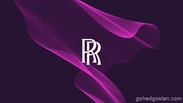
The double ‘R’ Badge of Honour is a timeless expression of true luxury. The badge, representing Rolls and Royce, the marque’s founding fathers, is known world-wide as a symbol of engineering excellence and the very best of human endeavour. It is no surprise therefore, that this famed signifier remains unchanged. The Badge of Honour will reside on the marque’s products alone – reserved solely for the precious creations born at the Home of Rolls-Royce in Goodwood, West Sussex.
The Monogram also retains its original form but replaces the Badge of Honour on collateral, while the Wordmark ‘Rolls-Royce Motor Cars’, as found presiding above the door of the marque’s establishments, was found to be corporate and unrepresentative of the marque’s standing as a House of Luxury.
Pentagram uncovered typography in the marque’s archives from the 1930’s and used an art-deco style as the basis from which to envisage a new Wordmark – one suitable for the modern-day Rolls-Royce. The words ‘Motor Cars’ have reduced in size, with the emphasis reverting to Rolls-Royce, in recognition of the marque’s significantly wider influence outside of the automotive industry. The Wordmark has become more refined in its appearance, depicting the quiet, whispering power of contemporary Rolls-Royce. Special significance has been paid to the letter ‘R’, to provide additional stability and prominence to this important character in the Rolls-Royce script.
Typeface
Pentagram’s design team explored multiple typefaces in search of a font that depicts luxury, without being overtly decorative. They believed the font must also demonstrate the connection with the marque’s rich history. The chosen typeface, Riviera Nights, stems from the same family as Gil Sans Alt, the marque’s previous font, but with additionally crafted and bevelled letters.
The Spirit of Ecstasy Expression
A wholly new visual treatment of the Spirit of Ecstasy has been created, called The Spirit of Ecstasy Expression. With an aethereal yet tech-like feeling, The Expression adds a cutting-edge aura to the new visual identity. Contemporary in appearance, The Expression speaks of the marque’s modern lifestyle presence.
Akin to a silken fabric, The Expression adopts a fluid form and is versatile in nature. An innovative digital tool that uses coding has been developed by Pentagram to enable The Expression to be used on any surface, from projection to embroidery, printing to engraving. It can be found in both physical form at the marque’s global establishments and in digital form – connecting the elements of the marque’s portfolio. The Expression will become a distinctive and recognisable element of the marque’s visual language, a key signifier of a House of Luxury.
MUSE – The Rolls-Royce Art Programme
Marina Willer’s previous appointment for Rolls-Royce was to design an identity for the new vision of the Rolls-Royce Art Programme. Re-launched in 2019, Muse consists of two new biennial initiatives, the Dream Commission and the Spirit of Ecstasy Challenge. Willer and team designed a distinct identity which captures the programme’s commitment to moving image art while linking it to the marque via an adaptation of The Expression.
The History of the Colour Purple
For centuries, fabric traders in the Phoenician trading city of Tyre in Lebanon would create just one gram of purple dye from 9,000 spiny dye-murex snails found in the Mediterranean. The exotic dye, which became known as Tyrian Purple, was so scarce that only the world’s royalty, emperors and ancient leaders could afford it. Exclusive use among such early leaders, who were often considered to be descendants of the gods, gave purple added significance.
In art, while purple pigments can be traced back to Neolithic cave paintings, it was the violets used in paintings of the Renaissance period that reflected the majesty and power of pious figures, who were often portrayed wearing violet robes. the 15th-century Florentine painter Cennino Cennini combined blue indigo and red hematite to create the desired shared, a combination that gives it power.
Echoing the regal majesty of purple, many musicians, including David Bowie, Prince and Jimi Hendrix, used the colour to express individuality and creativity. Prince was often seen wearing it and referenced it regularly in his work. For David Bowie, it was the mystery and rarity of the colour that reflected his desire to break the mould. When he created his alien-like alter ego Ziggy Stardust in 1972, purple gave him an air of power and theatricality that appealed to Stardust’s synthetic ideals.
Black has long been perceived as a colour of power and control – it is both unconventional and luxurious, especially in the context of high-fashion and VIP black-tie events. But purple teams that power with the desirable elements of mystery, intrigue and opportunity. Even though purple is now more easily replicated, it is still seen as a subtle indication of quality and excellence. It also reflects just how greatly the history of colour influences society and our perceptions of the world today.
Related Posts

No Comment